Image Credit: Archdaily & Cristobal Palma
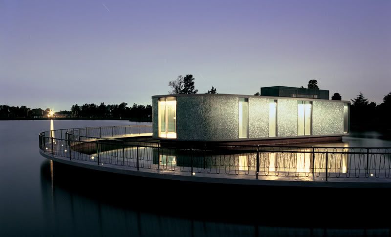
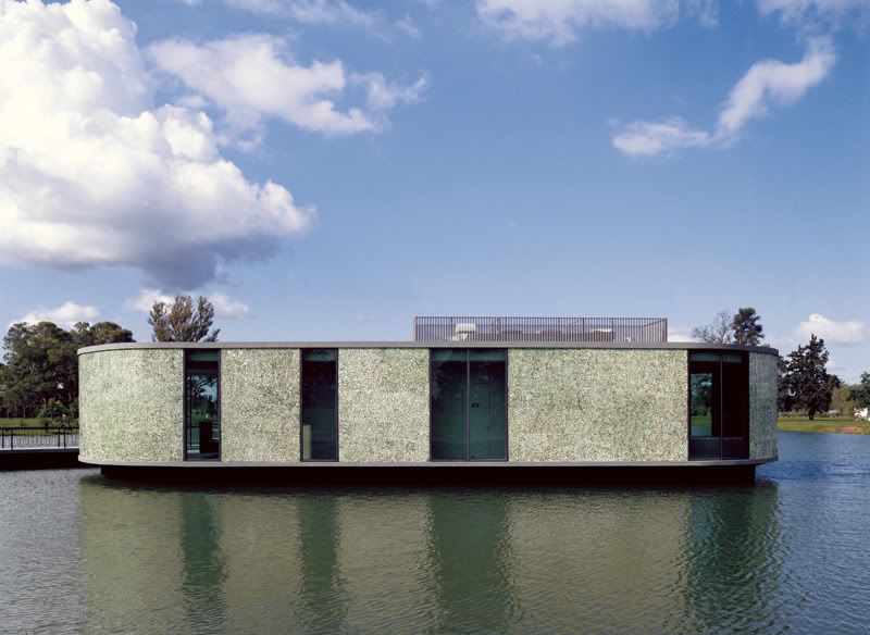
I fell in love with this building the first time I saw it on Dezeen about a week ago. Something about the choice of materials really struck me - I think it's the mid-century looking green-stone terrazzo wall. Also perhaps it was the seductive curves (it does sound a little weird to use the word "seductive" on a building but never mind) of this structure or the serene setting it sits in.
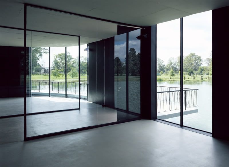
But now that I look at it again, I start to see the flaws of the building. It feels a little massive in its setting, perhaps because it feels a little too solid and manmade in its very natural setting. Maybe if it had more windows and less (not none) of that terrazzo wall, the building would have looked lighter. Perhaps it is also the rather dated looking balustrades that got to me - I mean it looked all 1970s theme park and all. Vertical metal balustrades would have been sleeker, or perhaps not even having balustrades would have heightened the impact.
Well anyway that's just my two cents worth. Nice building nonetheless.
- Leave your comment
- Share this on Twitter | Facebook | Delicious


Post a Comment