Showing posts with label Design. Show all posts
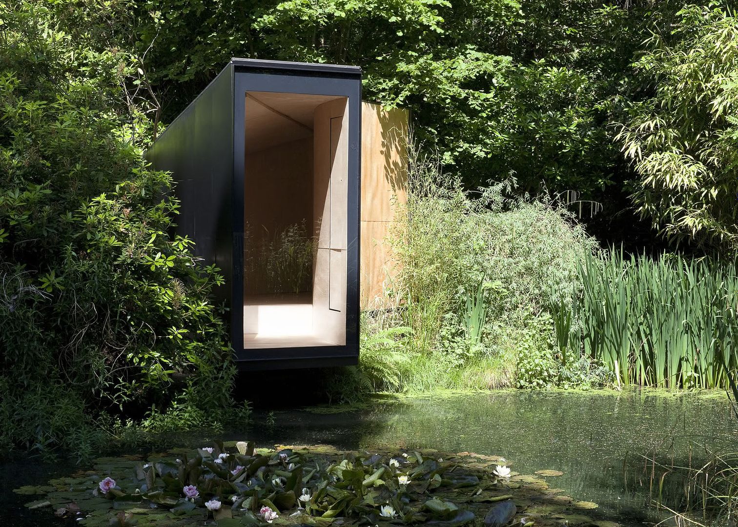
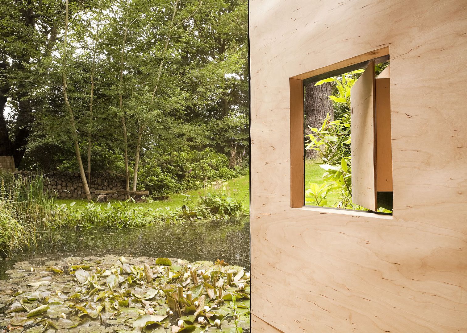
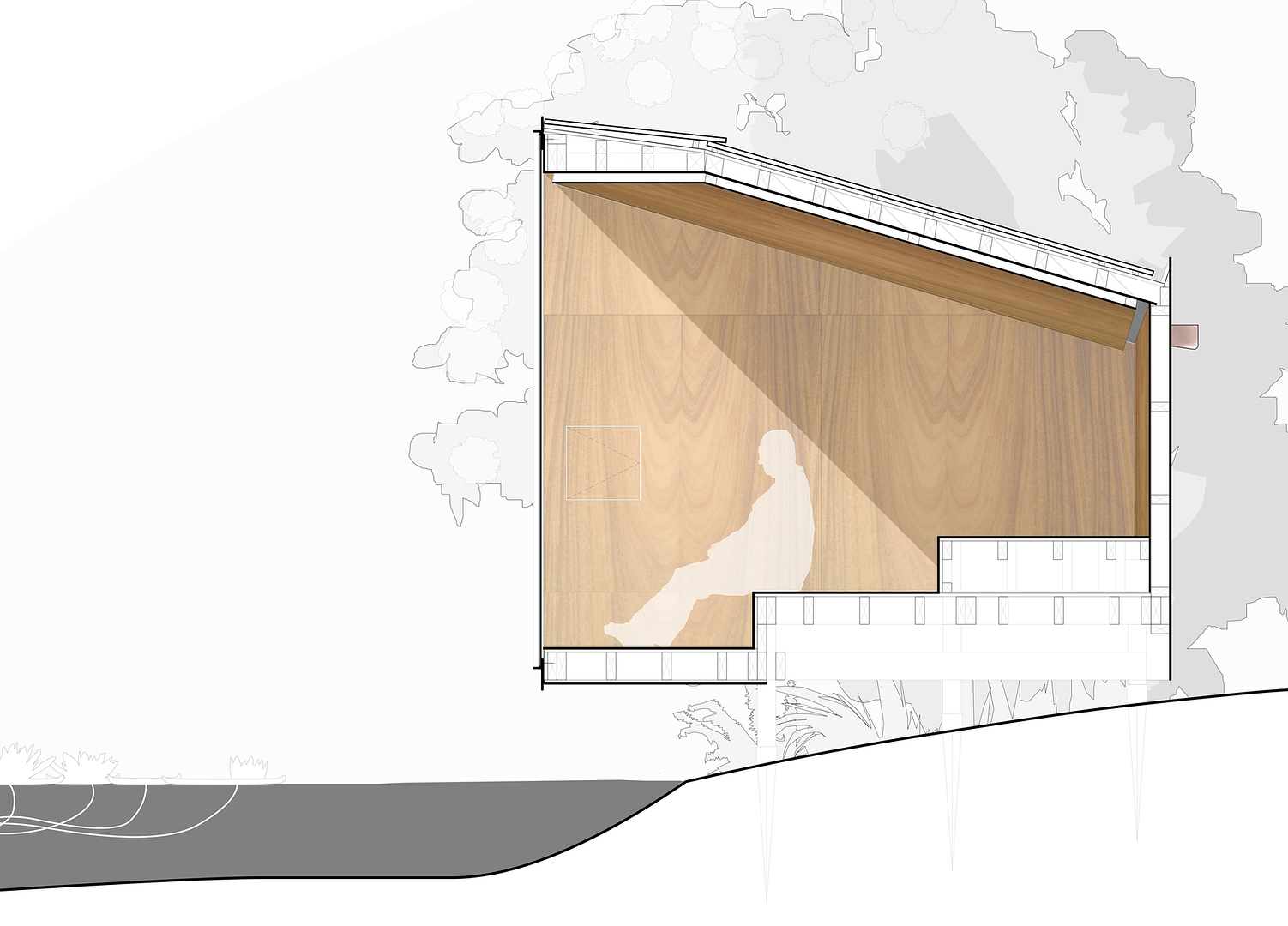
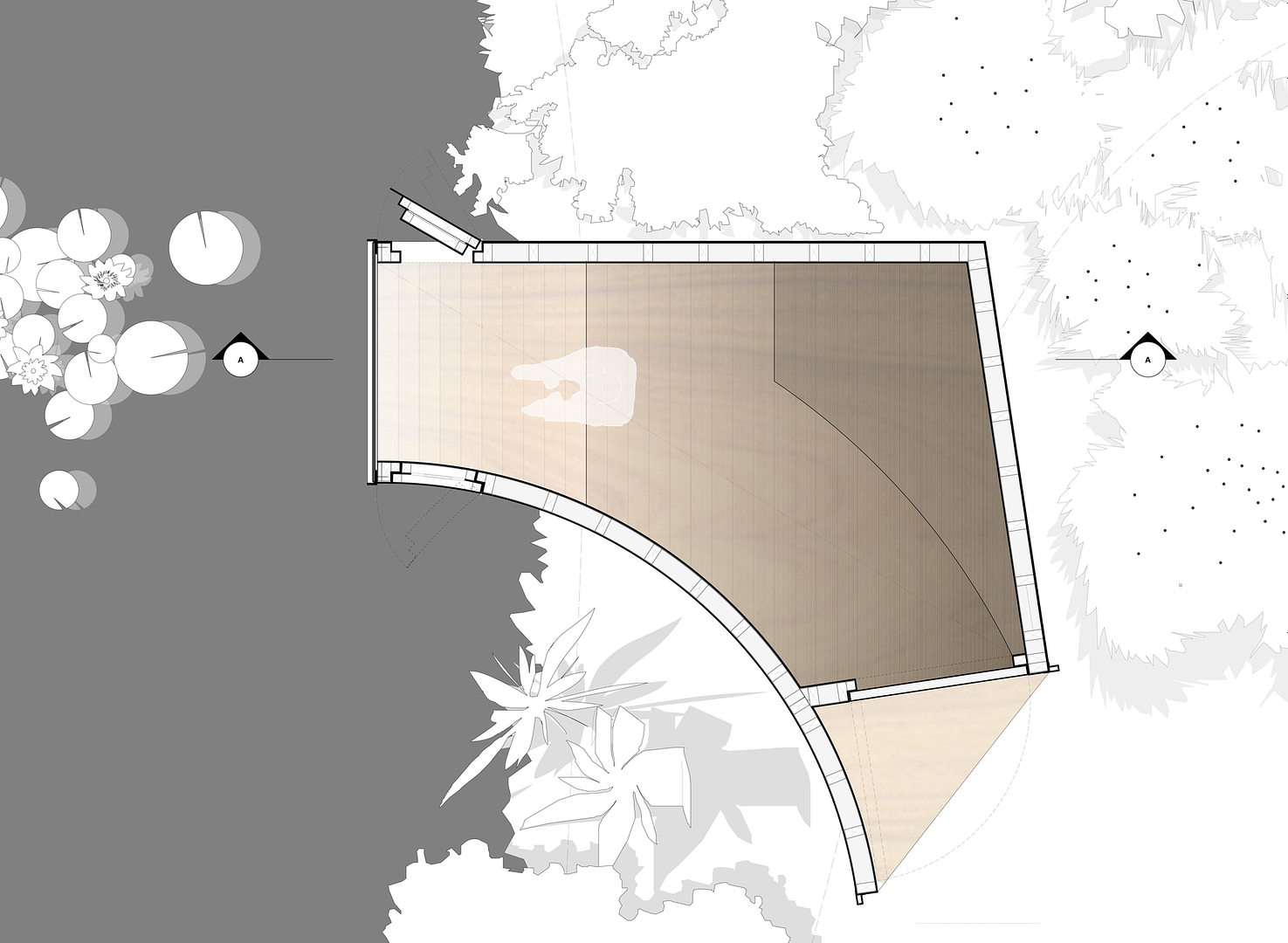
Image Credit: ArchDaily & Ben Blossom
Follies of any sort are almost extinct, especially in pragmatic Singapore. All we do is work work work, busy busy and busy ourselves. And that's an especially awful notion to contemplate, especially when more often than not, we simply hate what we're doing.
I guess that's why I'm so drawn to this project. It's sheer simplicity (both in form and function) make it so endearing. It's the perfect spot to escape from reality, especially when one has a Monet-worthy view to gaze at. I suppose that's what it's like to live within, or near the Botanic Gardens. I love how it frames up, and highlights what I suppose would be the loveliest views of the garden.
- Leave your comment
- Share this on Twitter | Facebook | Delicious

"When they saw the star, they were overjoyed" - Matthew 2:10
- Leave your comment
- Share this on Twitter | Facebook | Delicious
- Leave your comment
- Share this on Twitter | Facebook | Delicious
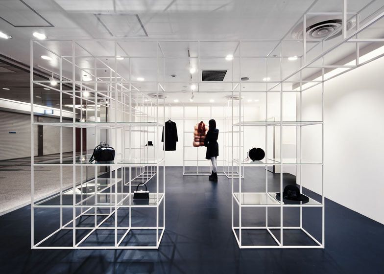
Image Credit: NI&Co. Architects via Dezeen
All I can say is that goodness, this store's design is conceptually really similar to the Grid Table design that I came up with just prior to my A-Levels.
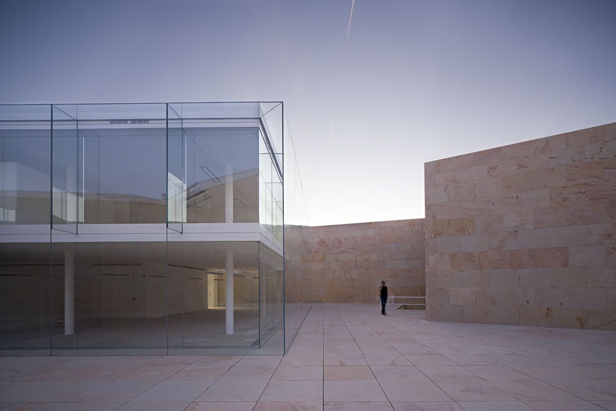
Image Credit: Alberto Campo Baeza
It is a stone box open to the sky that holds a crystalline box and protects it and tempers it, immersed in the midst of a wonderful garden.
Those were the architect's own words - the 'crystalline box' is truly beautiful, they evoke images of Apple stores, but without the oppressive sense of commercialism that the Mac shops imbue.
What I find truly interesting (and really ironic as well) is how the idea of transparency and openness within a very private space. Almost as though the architects were making a point on how the human spirit functions - yearning for a protected space to express themselves fully.
It's really pretty.
Yet how as some others have pointed out about the building, how does the building stay sufficiently warm in the (frigid) winter months while being sustainable?
Hmm.
I guess being pretty matters more.
- Leave your comment
- Share this on Twitter | Facebook | Delicious
1. Wes Anderson - From Above 2. Stanley Kubrick - One-Point Perspective
- Leave your comment
- Share this on Twitter | Facebook | Delicious
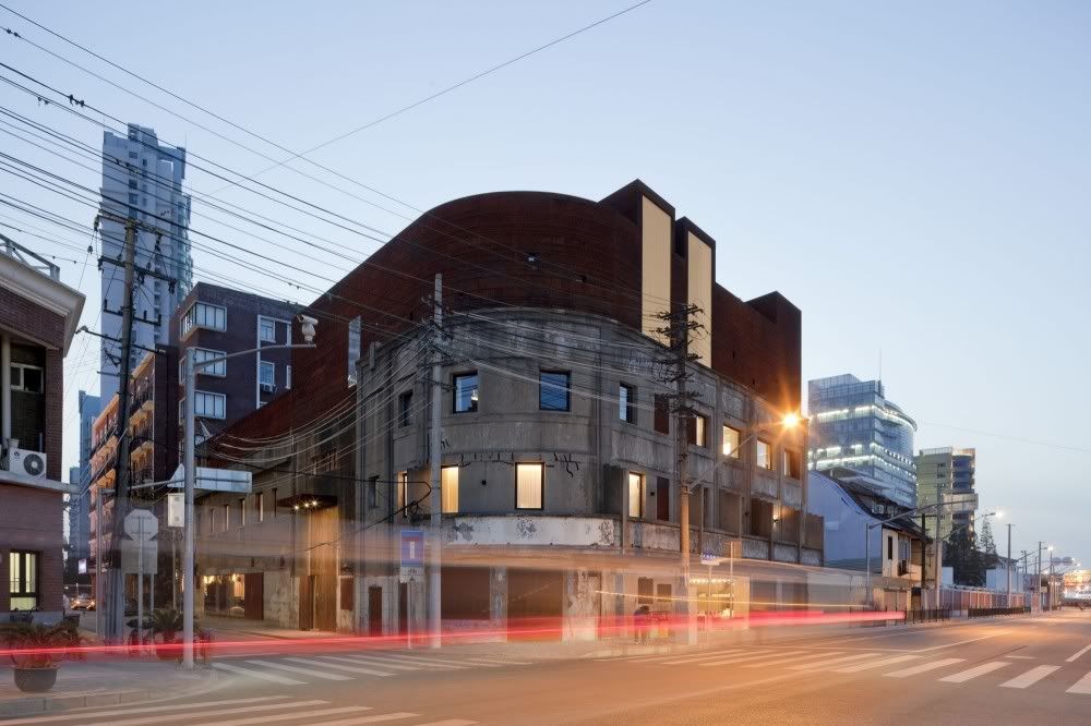
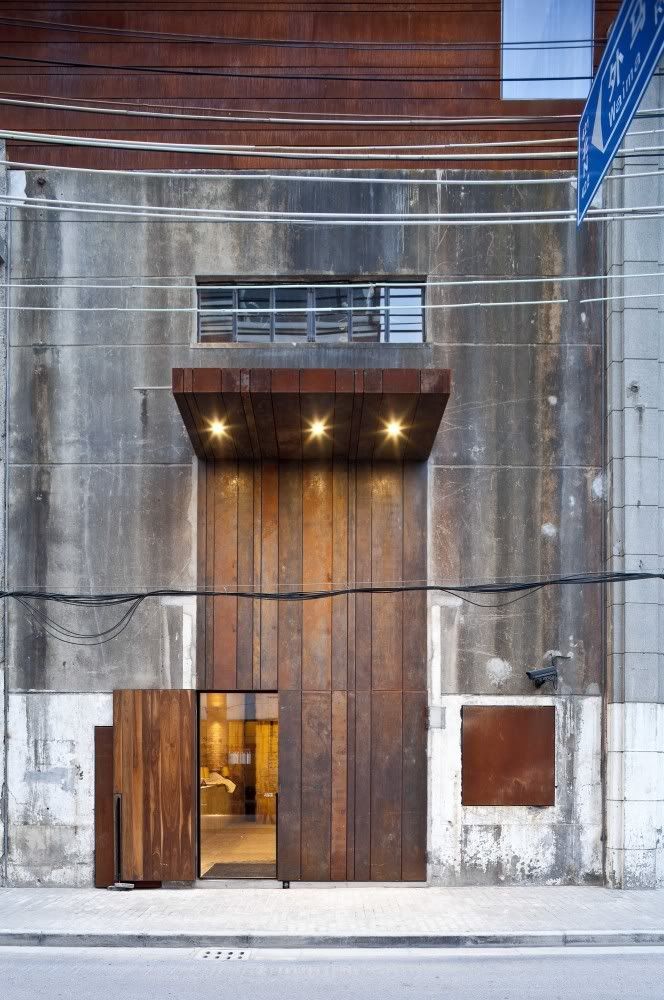
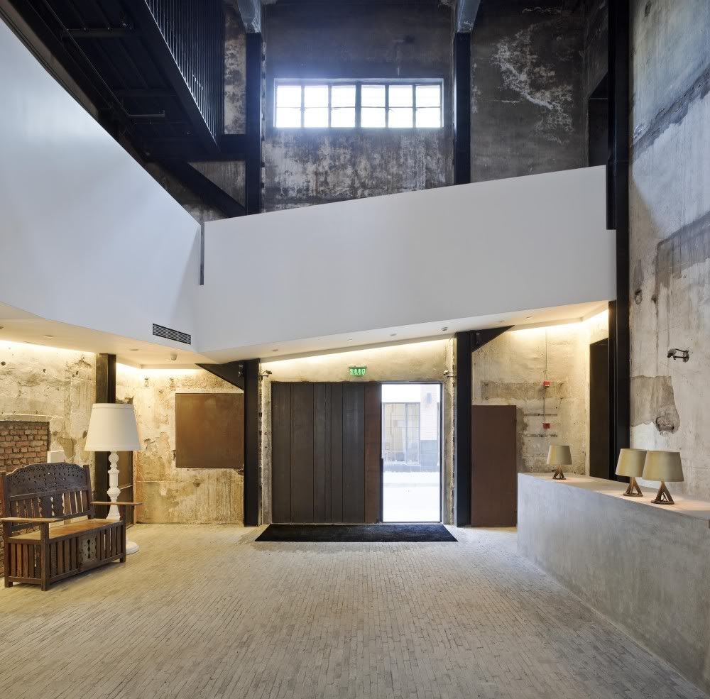
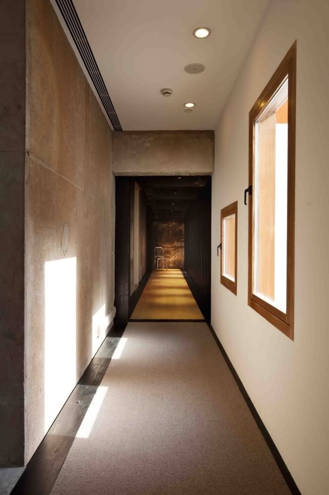
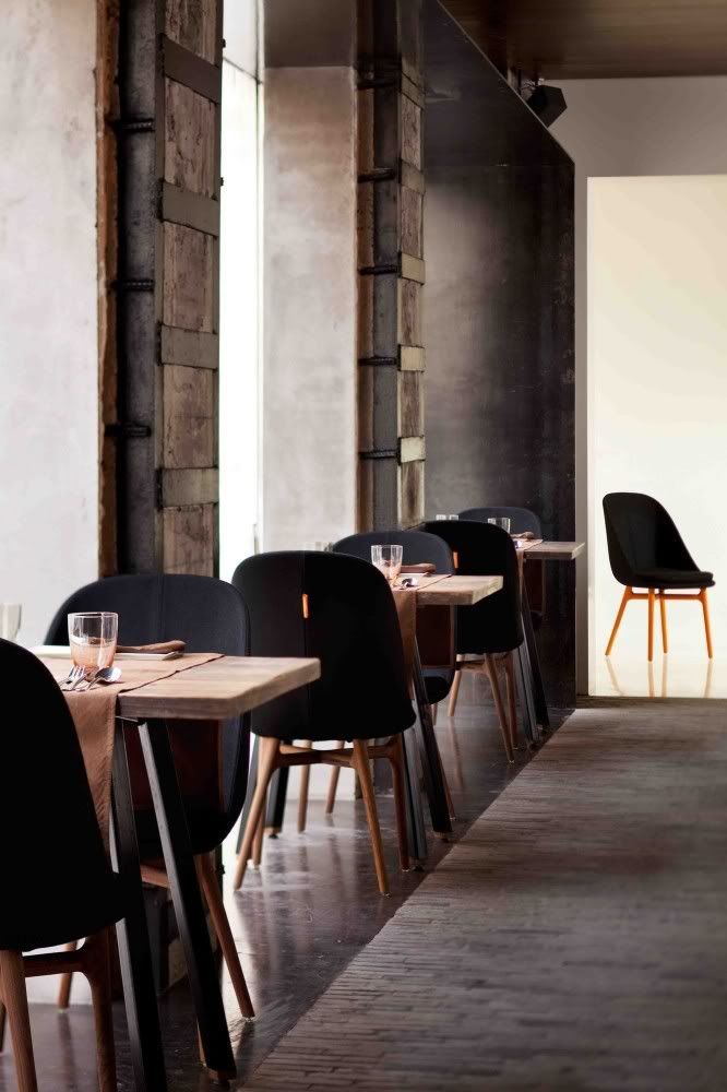
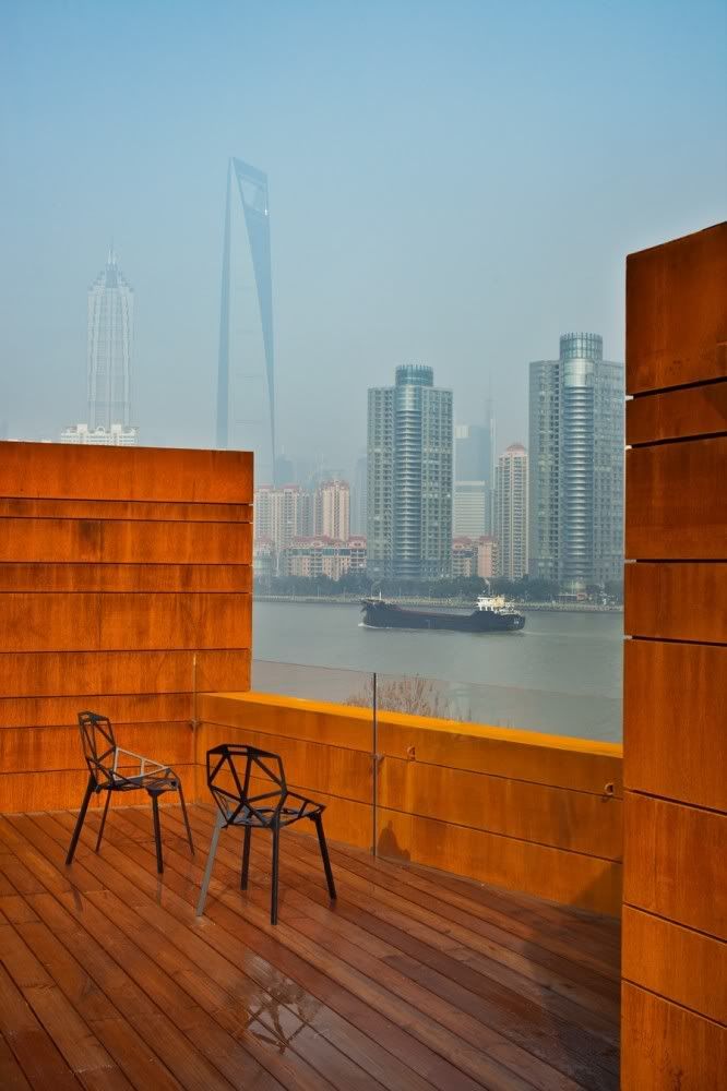
Image Credit: Pedro Pegenaute, Tuomas Uusheimo, Derryck Menere via ArchDaily
I love how the old structure's history is so respected, not only through the rawness that was preserved, but also through how the addition alludes to the building's past function as a shipping warehouse. Neri&Hu are truly one of the best architects to emerge from China.
- Leave your comment
- Share this on Twitter | Facebook | Delicious

Image Credit: Edmund Sumner via ArchDaily
Personally, I find this building to be quite interesting for a few reasons: it was (relatively) cheap to build, especially when one compares it to the dollar guzzling productions of the 2008 Olympics, it manages to be visually appealing despite being rather rectangular in form, and rather importantly, it is a building that considers its environmental footprint. Not many buildings can claim to meet all 3 of those.
On a related note, doesn't the building's external form seem very reminiscent of George Nelson's bubble lamps?
- Leave your comment
- Share this on Twitter | Facebook | Delicious


I spent a few hours at the museum yesterday. I really enjoyed it.
- Leave your comment
- Share this on Twitter | Facebook | Delicious
A particularly beautiful concept to ease the pain that is conjured up by the brain when the thought of taking medication (and by extension being ill) arises.
It's lovely to see local designers coming up with simple, yet deeply impactful design like this. That being said, in my opinion, it would be nicer if the paper used to contain the medicine had a little bit of prints on them - colours can affect the mind's perceptions on things. Minimalism need not be bland and colourless.
- Leave your comment
- Share this on Twitter | Facebook | Delicious
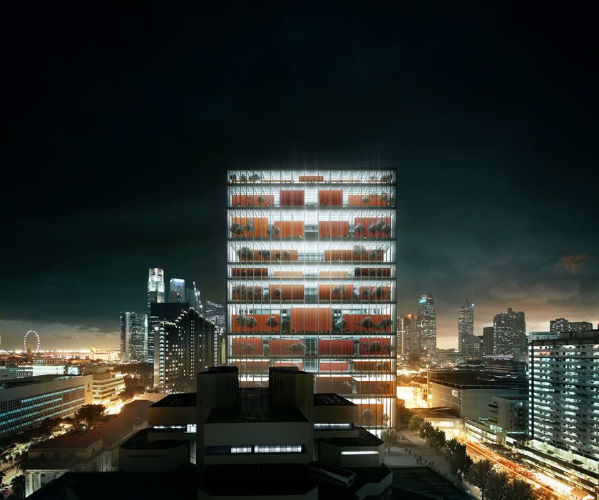
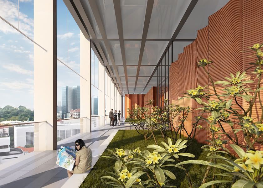
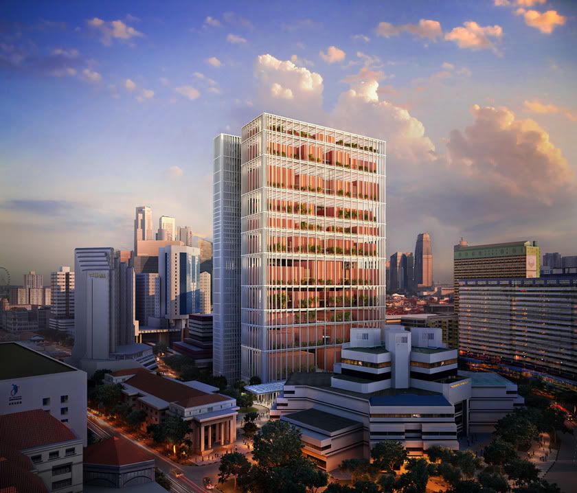
Image Credit: Serie Architects
I first saw this design a week ago (or so, I can't quite remember) while I was reading the papers, and I thought to myself, what a clean design for a court; what a neat way to suggest the strength and transparency of the Singapore legal system through an architectural metaphor.
Looking at the design again in closer detail, it is particularly interesting to note that the walls are clad in a terracotta material, forming quite a nice link with the surrounding (colonial terracotta-roofed) buildings.
- Leave your comment
- Share this on Twitter | Facebook | Delicious
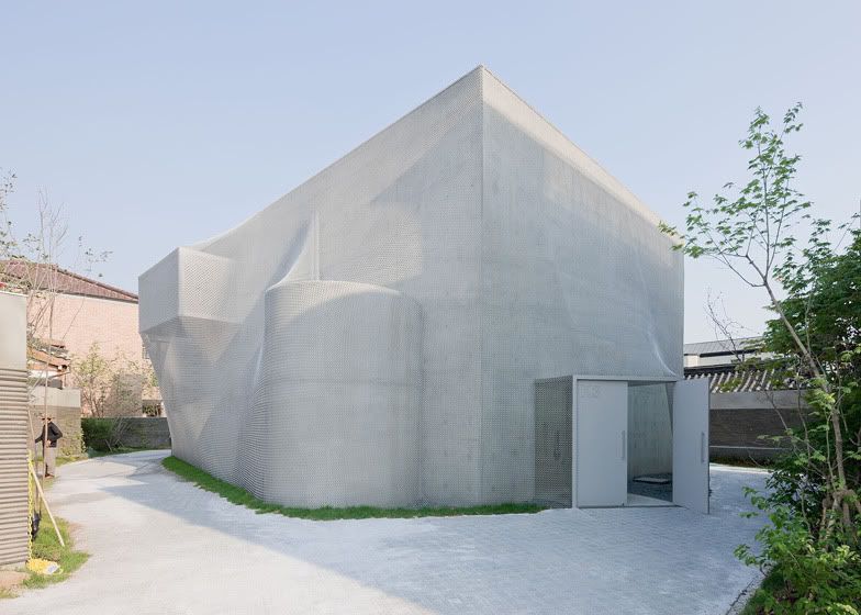
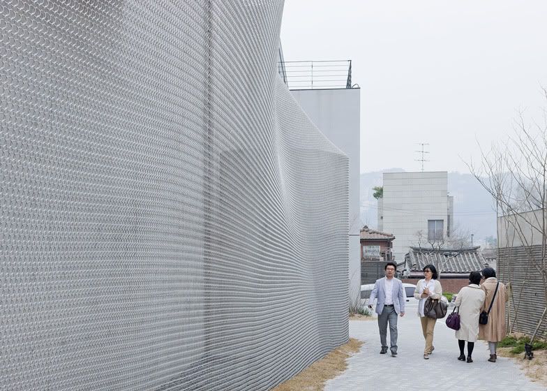
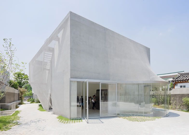
Image Credit: Iwan Baan & Dezeen
So what if the fa�ade is merely decorative? I find it really interesting that the entire building becomes a work of art (or a sculpture, depending on how specific you'd like to be) simply because of the material that it is draped in - chain mail. I also wonder if the chain mail sways in the wind - such an interactive fa�ade would definitely add to the aesthetic appeal of the place, as well as further define the venue's purpose as an art/sculpture gallery.
- Leave your comment
- Share this on Twitter | Facebook | Delicious
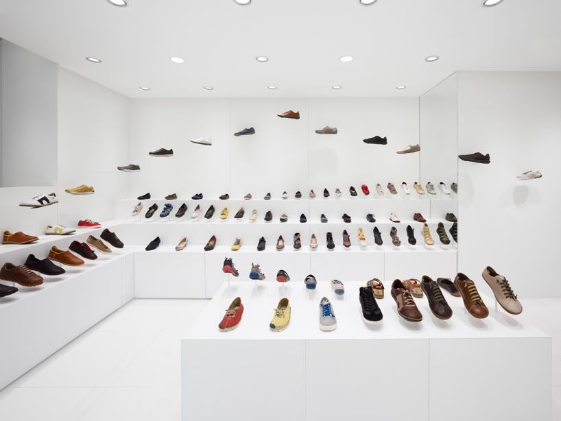
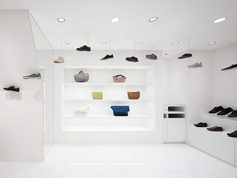

Image Credit: Masaya Yoshimura & Designboom
Nendo has been producing some of the cleanest and most distilled works that I have ever seen - the very simple idea of walking around in a pair of [Camper] shoes has been presented in a literal but extremely beautiful manner of shoes trodding around the store.
I'm really quite amazed by the simplicity and pureness of this idea!
- Leave your comment
- Share this on Twitter | Facebook | Delicious
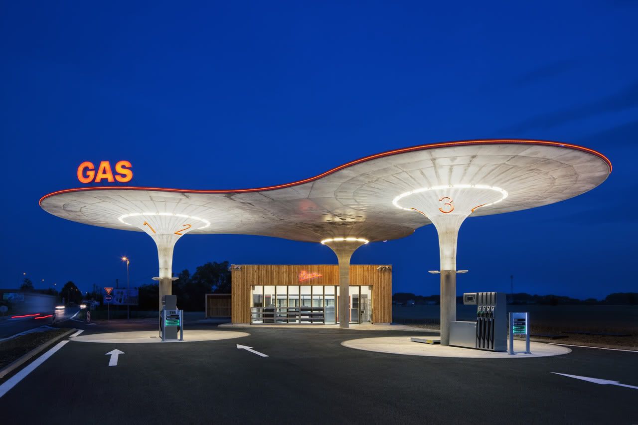
Image Credit: Tomas Soucek & ArchDaily
There's something particularly space-age about the design of this gas station, almost as if it were pulled from the vacuum of time (from the groovy 60s) and slapped into somewhere in Slovakia. Even the red neon band that runs across the roof alludes to this (perhaps unintentionally though).
That being said, the "larch kiosk" looks really out of place, it doesn't work well with the futuristic shape of the main structure - somehow I sense the architects intended for it to be that way, but I really hate that. Oh well.
- Leave your comment
- Share this on Twitter | Facebook | Delicious
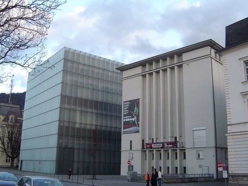
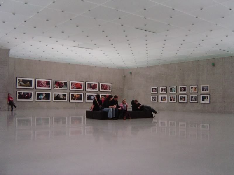
Image Credit: Flickr User mightymightymatze via ArchDaily
Peter Zumthor is truly a master at creating spaces that while architecturally seem simple and sparse, are able to evoke so much emotions within an individual; from the introspection that is encouraged through his 2011 Serpentine Gallery Pavilion, to his iconic work at Therme Vals.
I simply love how frosted glass is used here - it is a material that I find enthralling, it reveals, yet hides, and the quality of light that it allows in is simply ethereal.
- Leave your comment
- Share this on Twitter | Facebook | Delicious
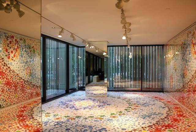
Image Credit: CityNomads
Entering the space where the exhibition was held at (the 3rd floor of Hermes at Liat Tower), I was rather surprised to find what I saw - the exhibition was literally the room itself. That wasn't something that I took notice of when I found out about the installation via the Straits Times (I was in camp though during that period of time, maybe that's why I didn't quite read it properly).
I still remember why I wanted to see Moment and Eternity the moment I found out about it - the rich patterns that evoked traditional Japanese imagery found on kimonos. The richness of colours was also another thing that I wanted to experience first hand. I enjoyed the former when I visited, but not so much of the latter - upon seeing the installation, I noticed that the prints (especially those on the floor) were worn away. That was when I realised that transience and the impact of our actions were themes that the artist wanted to convey. Quite impactful indeed, especially in today's interconnected world.
That being said, I was a little disappointed that the installation was not as immersive as I envisaged it to be; I thought that I would be literally be surrounded by a riot of colours and patterns - that wasn't the case because of the architecture of the space.
Moment and Eternity is an installation at Liat Tower's Hermes, and is available for viewing from 20 April through 3 June.
- Leave your comment
- Share this on Twitter | Facebook | Delicious
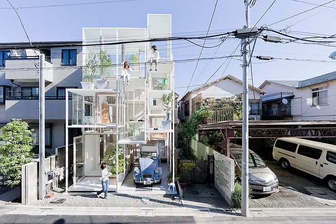
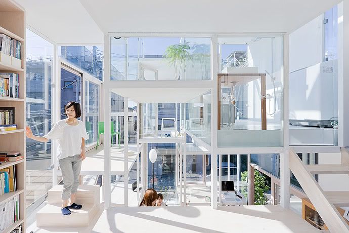
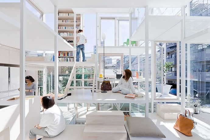
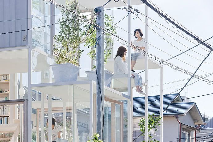
Image Credit: Iwan Baan & ArchDaily
I'm truly amazed to see that such a house exists in Japan, one that is so exposed and so open to the world - in a land where privacy is so acutely valued. This particular house goes against all the rules that the design world has come to deem as being quintessential to a Japanese home. It's really intriguing that the young couple who own this house want to live in such a manner; its really radical!
- Leave your comment
- Share this on Twitter | Facebook | Delicious
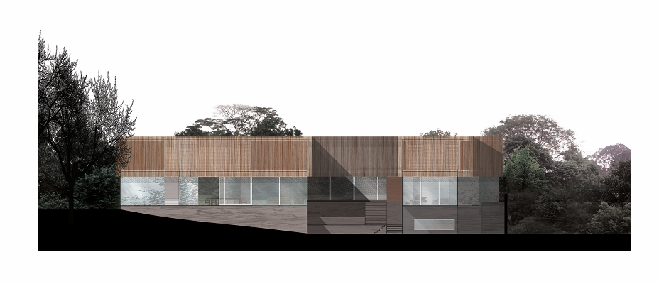
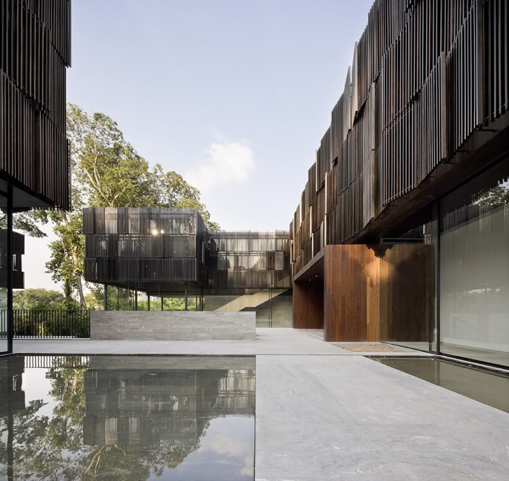
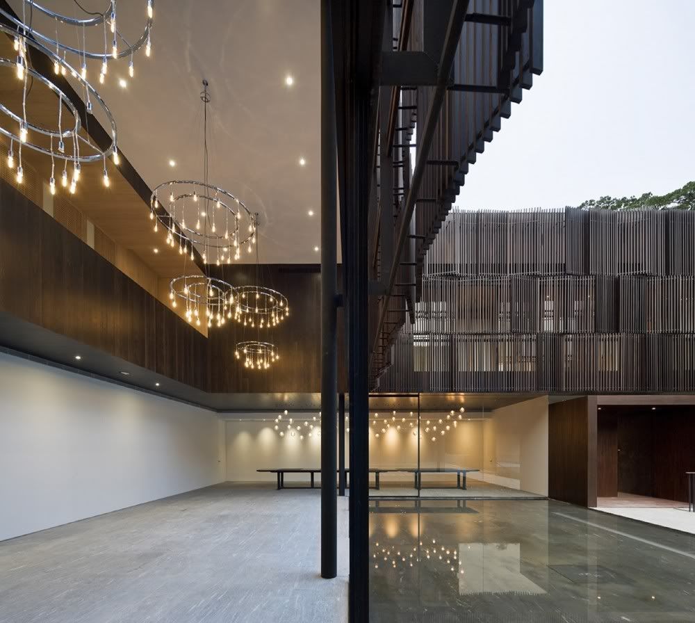
Image Credit: ArchDaily & Pedro Pegenaute
A very nice example of how tradition can merge with the modern, in this case, how Neri & Hu managed to incorporate elements of the Chinese courtyard home into a modern structure. My only gripe is that the house seems excessively large, but then again, wealth has the tendency to make itself known.
- Leave your comment
- Share this on Twitter | Facebook | Delicious
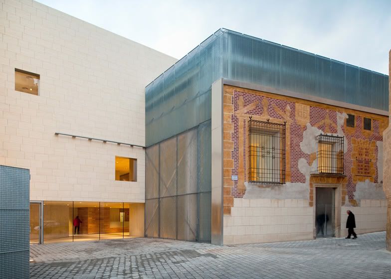
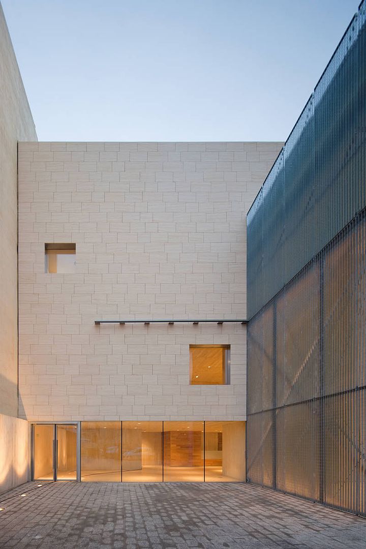
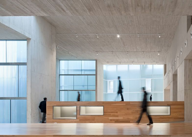
Image Credit: ArchDaily
I love how the old fa�ade was weaved so interestingly into the modern addition, almost as if it were a piece of art hung on a gallery wall. The interplay of light in the spaces of this museum is also quite nice - especially how it shines though the translucent material (I'm not sure if it's plastic or frosted glass).
- Leave your comment
- Share this on Twitter | Facebook | Delicious
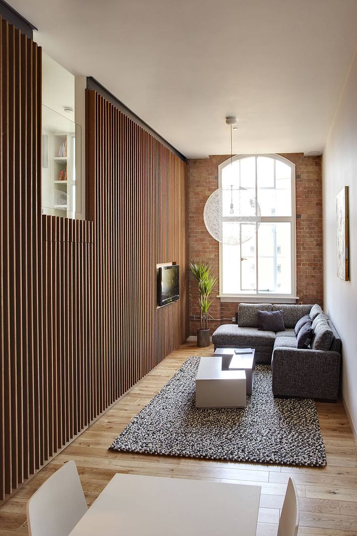
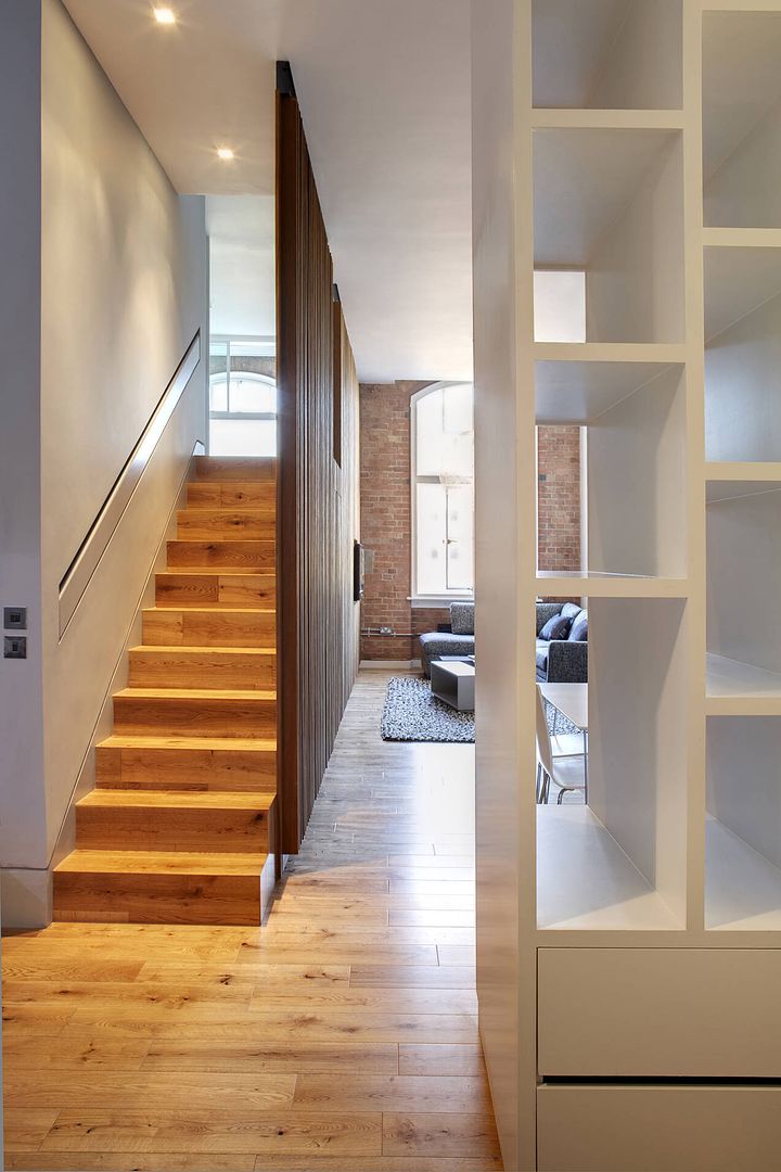
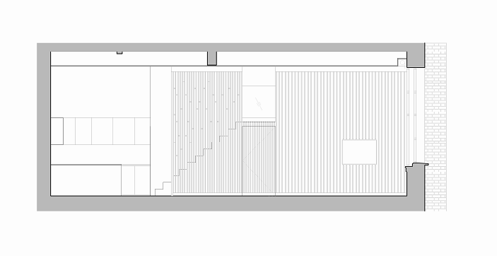
Image Credit: ArchDaily
A rather good studio conversion project, housed in a former matchbox factory. Somehow, it reminds me of those SOHO projects by Far East Development, though it seems to be better executed, undeniably because it is not a mass-market project.
- Leave your comment
- Share this on Twitter | Facebook | Delicious


