Image Credit: Tony Sandoval via deviantArt
Its been a long time since I've last been to deviantArt.
- Leave your comment
- Share this on Twitter | Facebook | Delicious
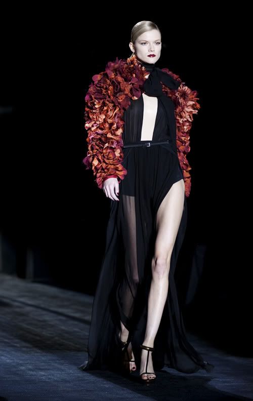
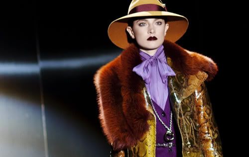
Image Credit: Gucci, The Sartorialist
The content on here has been a little, monochromatic to say the least as of late. Here's a bit of colour, courtesy of Gucci FW'11.
On a side note, they look so femme fatale-ish, darkly seductive.
On a second side note, the petal like thingy on the
lady's shoulder reminds me of Tokujin Yoshioka's Bouquet chair for Moroso.
- Leave your comment
- Share this on Twitter | Facebook | Delicious
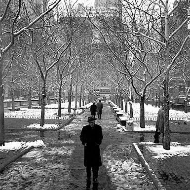
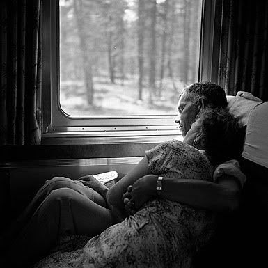
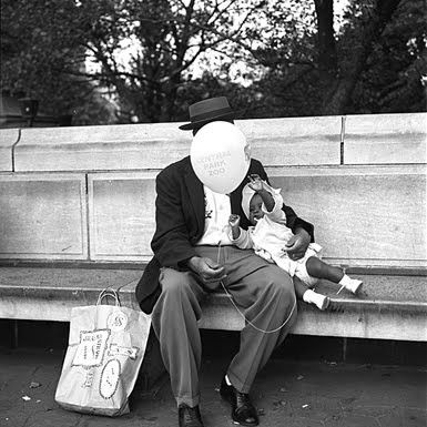
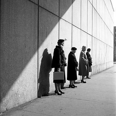
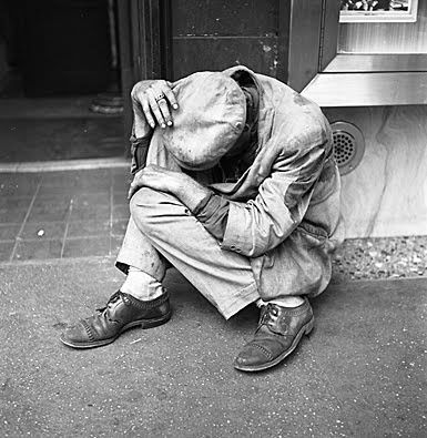
Image Credit: Maloof, Vivian Maier
Belinda Luscombe, in Time describes the story of Vivian Maier's discovered photos beautifully:
The way she practiced her craft suggests that she was more interested in looking that being looked at.
- Leave your comment
- Share this on Twitter | Facebook | Delicious
I think there is something intrinsically beautiful about curved staircases. Perhaps its because at certain angles, they seem to follow the form of a Golden Spiral. As for the B&W picture of the car park, I've seen something like that before, so I decided to give it a try. The way the light reflects off the satin floors is simply astounding.
I'm somewhat enamored by the grittiness of these two photos, as well as the mostly geometric forms that create them (hawhaw, self praise). Though that being said, I'm not entirely satisfied with them, I'm sure you'll see why.
- Leave your comment
- Share this on Twitter | Facebook | Delicious

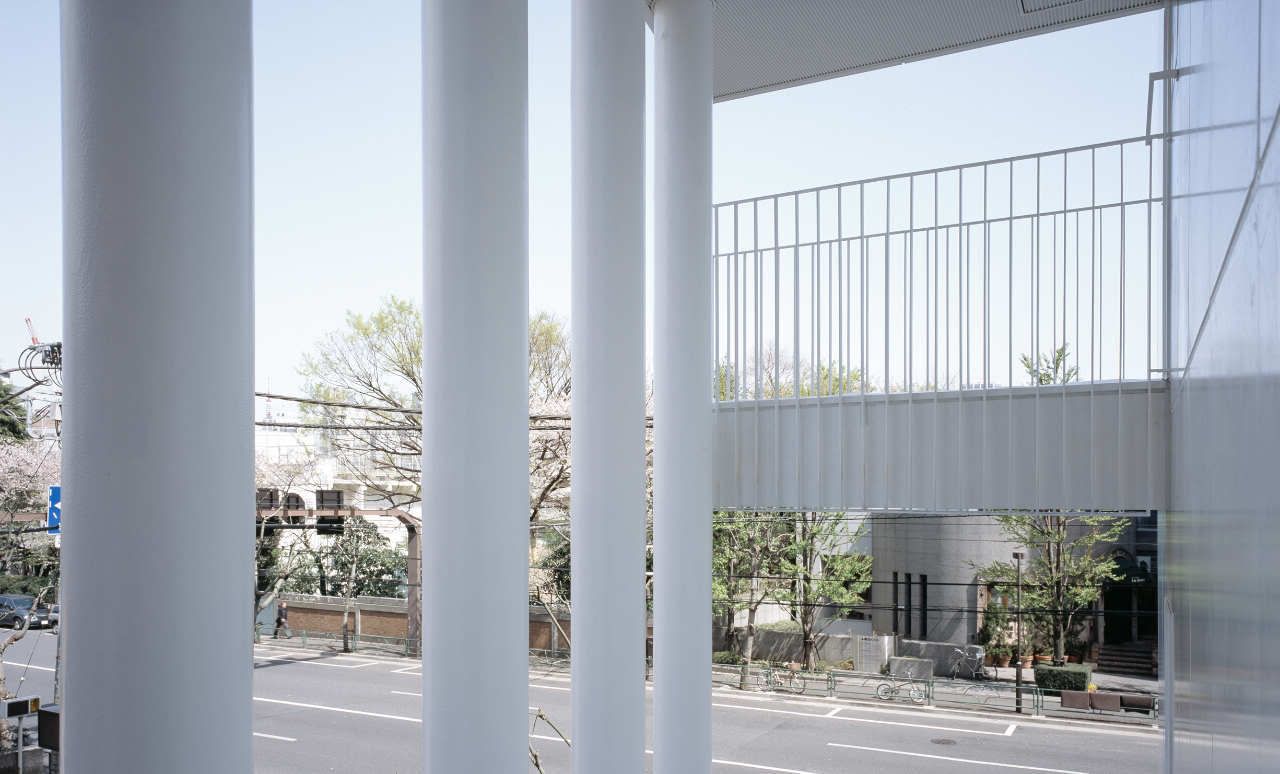
Image Credit: Takeshi Yamagishi and ArchDaily
Clean, simple, delicate. I especially love the lightness of the pillars in the second picture. The building is somewhat reminiscent of origami, right?
- Leave your comment
- Share this on Twitter | Facebook | Delicious

Image Credit: Wikipedia
You learn something new; from Wikipedia:
French for 'against daylight'. Contre-jour produces backlighting of the subject. This effect usually hides details, causes a stronger contrast between light and dark, creates silhouettes and emphasizes lines and shapes. The sun, or other light source, is often seen as either a bright spot or as a strong glare behind the subject. Fill light may be used to illuminate the side of the subject facing toward the camera.
- Leave your comment
- Share this on Twitter | Facebook | Delicious
Image Credit: John Pawson Architects
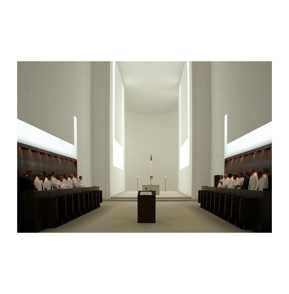
I'm really ecstatic to have found this project. Just last night, as I was flipping through a book full of Vincent van Duysen's work, his design sensibility and vision reminded me of this particular project.
I chanced upon this project in a design magazine many years ago, probably when I was still in elementary school. I can't say exactly why I remember it so well, but perhaps it is the monastery's austere and minimalism that really captured me.
Rediscovering this project tonight felt almost like a sense of awakening to me - I suspect that its because this was one of the first pieces of [quality] modern architecture that I chanced upon.
- Leave your comment
- Share this on Twitter | Facebook | Delicious
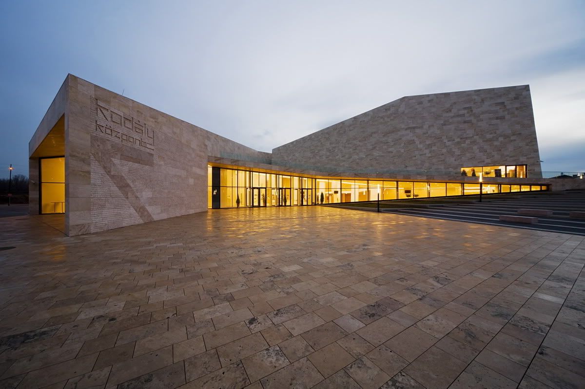
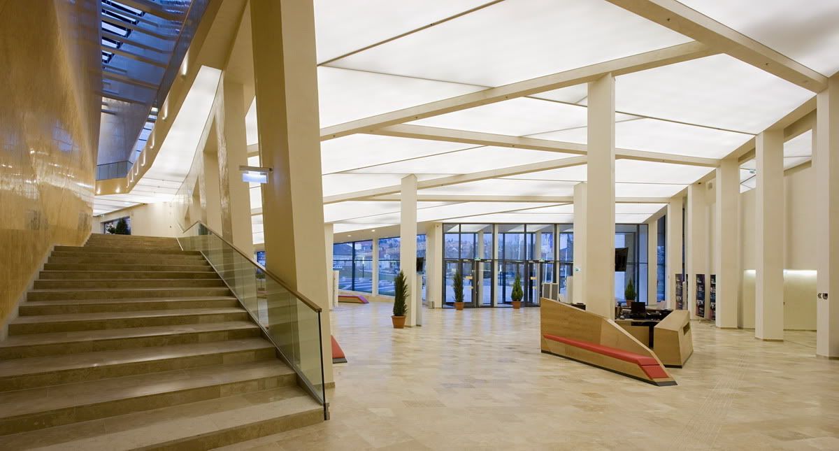
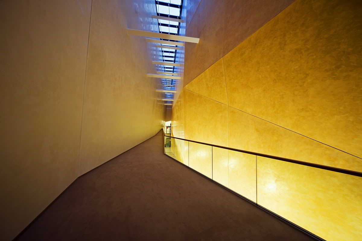
Image Credit: Tam�s Bujnovszky and ArchDaily
- Leave your comment
- Share this on Twitter | Facebook | Delicious

The American Restaurant - Warren Platner
Image Credit: Bing Bang Pouf
This restaurant dates to the mid 70s, and I suppose the style does show its age. But what I especially love about the design is the window covering and that massive column ceiling thingy. It reminds me a fair bit of a recent project I've seen on Archdaily. Quite nice.


