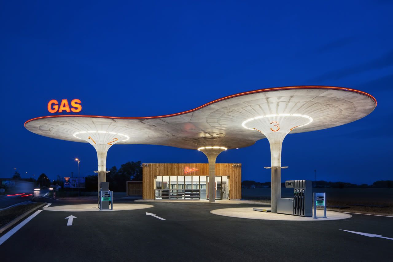
Image Credit: Tomas Soucek & ArchDaily
There's something particularly space-age about the design of this gas station, almost as if it were pulled from the vacuum of time (from the groovy 60s) and slapped into somewhere in Slovakia. Even the red neon band that runs across the roof alludes to this (perhaps unintentionally though).
That being said, the "larch kiosk" looks really out of place, it doesn't work well with the futuristic shape of the main structure - somehow I sense the architects intended for it to be that way, but I really hate that. Oh well.
- Leave your comment
- Share this on Twitter | Facebook | Delicious


Post a Comment